Summary
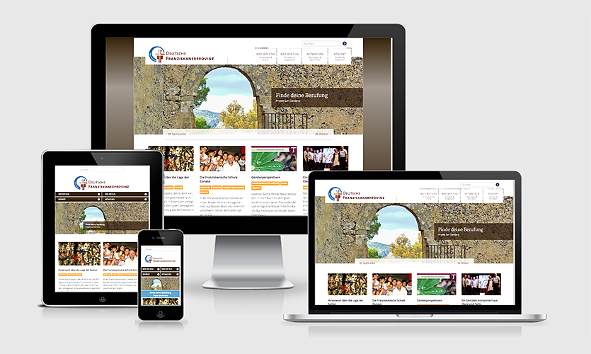
The Franciscan Province of Germany wanted a more modern look and feel for its website. The former website was not responsive, that is it was almost impossible to view on mobile devices. Looking at the content of the website, it also turned out that blog posts on current topics could barely be found by visitors.
We developed a content strategy and built the WordPress base accordingly. Current topics now take centre stage, the website has become a modern and lively communication hub.
Background information
The Franciscan Province of Germany consists of 350 members and 35 branches of the Franciscan Order in Germany. There are friaries and convents as well as educational institutions and social services. Like for many fraternities, it is difficult for the Franciscans to attract young people. This is one of the more important reasons to focus on developing the new website as a communication hub with a broader public.
The structure of the former website was basically built for static content. At the same time, quite a few editors wrote a lot of interesting content called “News”. Unfortunately there was no prominent place to display these articles, they ended up in sidebars and rather soon were hidden from view in an archive.
Process
The first step was an initial workshop with the Franciscan Province’s media team to figure out what the main goal of this new website should be: Unostentatiously getting into a conversation with people, especially with people who are not deeply ingrained within the (catholic) faith.
This lead to the question: Who are these people?
We identified different groups of people, for instance people who are searching for a spiritual home, people who might not have a close relationship with Catholicism or church in general.
Another vital group are people who want to help others, either by volunteering or by donating money. They are looking for projects they believe are trustworthy.
And last but not least, men who are interested in joining the fraternity for whom the website should provide a low level option to get in touch.
Design
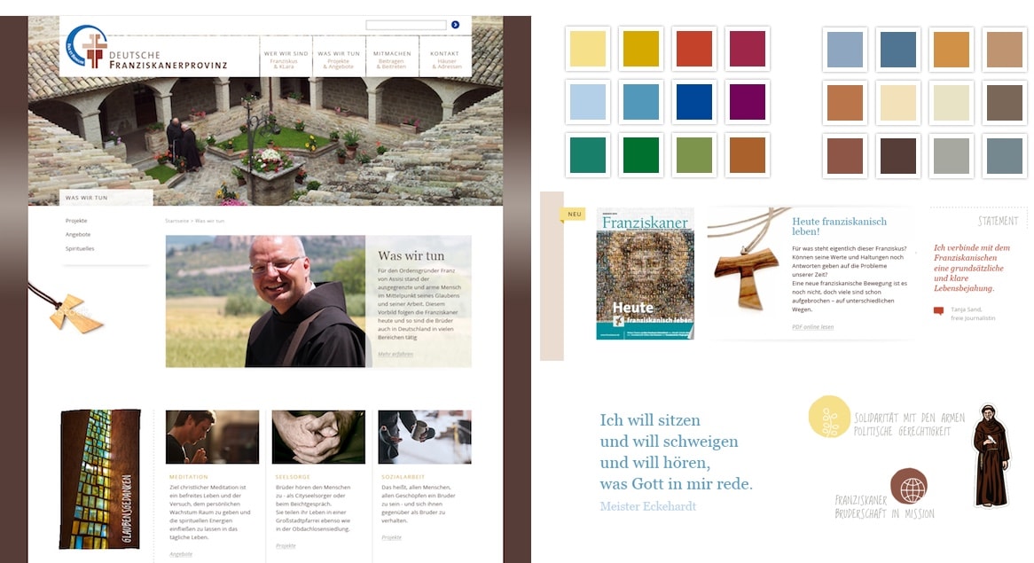
Our colleague Katja Schwarz developed a clear and welcoming look and feel. The design manages to connect tradition and modernity in its elegant visual appearance. The website appears open and modern but does so without trendy effects and gimmicks.

Content
One of the most important goals of developing the website anew was to showcase all the articles on contemporary issues.
With WordPress this can be easily done: WordPress distinguishes between static content and posts. WordPress’ build-in blog functionality is a powerful means to process and present that kind of content.
Part of the relaunch process was to make the decision which content elements should be transfered from the former website to the new one. It would not have made sense to transfer all the content, especially since the structure and the focus of the new website are rather different from the former one.
We therefore made an extensive content audit: we recorded all content elements of the former website, and, with much assistance of the Franciscan web team, assessed what was there. We transfered very important content, other content elements were edited, a rather big share did not make it into the new website.
All of the insights and results we gained from our conceptual work lead to the custom WordPress theme we finally developed for the Franciscan Province of Germany.
Conclusion
The new WordPress website provides a robust, up-to-date base for the work with todays’ world’s questions. Adding and managing content has become a lot easier and faster.
Today, this permanently growing content base is the heart and soul of the Franciscans’ website. Visitors feel more welcome, the website invites to start an open and lively dialogue.