Summary
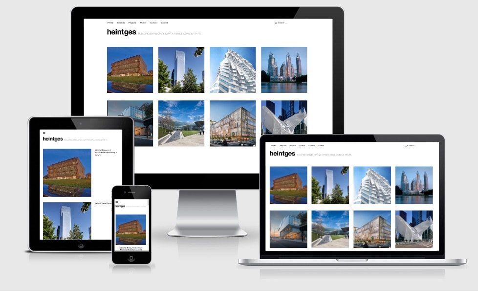
The architecture company Heintges had picked Elmastudio’s UBUD theme for the relaunch of their website. The most important task of the website is to showcase Heintges’ impressive construction projects.
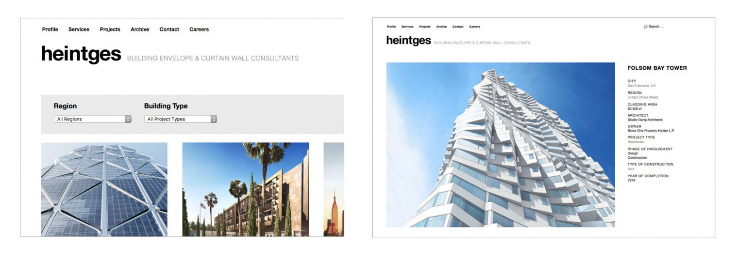
In order to allow for UBUD to support that kind of showcase, we needed to extend the theme’s functionality. We added a few page templates as well as an elaborate filter function for the construction projects and took care of the transfer of the projects to the new website.
Background information
“Heintges Consulting Architects & Engineers P.C. is an award-winning professional firm offering the highest level of expertise in the design and implementation of the building envelope.”
Heintges is a firm specialised on curtain wall and exterior cladding for building projects within the US but also in more than 24 countries worldwide. Heintges has designed and consulted on some of the most prestigious cultural projects in New York City, including the renovation of the United Nations Headquarters, the new Whitney Museum of American Art, Lincoln Center, and the Museum of Modern Art.
The client had been working on the UBUD theme single-handedly. As soon as you start to adjust templates, you also need to adjust the style sheets accordingly, otherwise you won’t be able to maintain responsiveness, that is that your website is looking good and can be used on all screen sizes. If you want to use an existing theme, maintain the theme’s look and feel and at the same time add to the theme’s functionality, you need to have deep knowledge of both the theme itself but also of frontend development, especially CSS.
Since we have been huge fans of elmastudio themes and have worked well with many of them, we were able to assist Heintges at this point.
Our task was to adjust and extend the UBUD theme in such a way that adding and maintaining projects would be easy. We worked closely with the Heintges team and tested usability on the go. Additionally, visitors were supposed to be able to sort the projects in manifold ways.
Process
In close cooperation, we first developed a concept to help distinguish between projects. Especially interesting projects that are presented using impressive photography needed to be kept separate from the regular projects, which come with few if any images.
We defined the two project types as different so-called “post types”. This way, an editor knows easily where to add new projects. This also helps to easily follow through with the different way to present both project types. For you as a visitor it’s clear at first glance which projects offer more information, e.g. images, and which don’t.
Prospective clients have the option to filter the projects according to different criteria: location (city, country, continent), and building type. This way it is easy to find projects that might resemble what they are looking for.

The first step was to export content from the former, static website and add it to our new WordPress install. Project data was only available as spreadsheets. Therefore we needed to do a CSV import, seperated for the two different project types. To make sure everything went well the Heintges team went through all the data once more and adjusted projects if necessary.
Most of the communication took place via Trello, plus occasional conference calls.
Conclusion
Heintges Building Envelope & Curtain Wall Consultants now have a website that showcases their projects beautifully. All major projects feature beautiful photographs. These images create an impressive visual appearance with the help of UBUD’s portfolio view.
Another important task was to keep usability as simple and as robust as possible. It is now easy to create and maintain the projects, so that the Heintges team can keep the projects up-to-date.
Backups, updates and maintenance are covered by a service agreement.